
Every business owner knows how important a website is. It’s literally the center of your digital footprint. While the 5-star Yelp reviews or amazing Instagram aesthetic might draw them in, your website has the ability to convert or lose a lead forever. So how do you ensure your website is easy to navigate from every angle? Easy – responsive web design.
By using responsive web design, your site becomes an easy-to-find oasis that customers love to visit time and time again, no matter what device they are using.
What is Responsive Web Design?
Responsive web design is a type of design that can adapt to different screen sizes. It allows your website to resize, and shift each section to fit neatly on your iPhone, laptop, and desktop. Each image is still beautiful, every button still works, and the text doesn’t take over your entire screen.
A responsive website creates a consistent, user-friendly experience for every visitor so they don’t have to deal with pinching, zooming, or award scrolling to navigate your website. In the world of technology, where everyone has at least 3 devices (maybe a laptop, a phone, and a tablet) a responsive website isn’t just a buzzword, it’s necessary for your digital success.
Why is Responsive Web Design Important?
The obvious answer? Flexibility. Your website can look absolutely stunning on your laptop, but if you don’t have a mobile responsive website you’re going to lose out on a huge amount of traffic.
Users want control of where and how they shop. That’s why it’s crucial to make your website as easy to use as possible across any device. Of course, there are other benefits to providing your audience with a fully responsive website.
Improved User Experience
Angry clicks lead to lower engagement rates (also known as high bounce rates). When it’s easy to navigate your website, customers are more likely to spend time browsing each corner of your site and learning more about the services you provide.
Creating a positive user experience builds trust in your business and encourages conversions like form fills, purchases, and bookings.
Better Search Engine Rankings
Google loves mobile-friendly websites. So, having a fully responsive website can also lead to increased rankings across search engines and bring even more traffic to your site. After all, no one’s digging through page 3 of the search results page.
Future-Proof
With new phones, tablets, and computers being released yearly, using a responsive web design ensures your website is still easy to navigate and digest on any screen the future may hold. This helps your business stay relevant and in business while others get buried in the sands of time.
Key Elements of Responsive Web Design
Responsive web design relies on several key elements to ensure your website is functional and visually appealing on all devices. These elements work together to create a seamless experience for users, regardless of the screen size.
There are three 3 key elements to every responsive web page. These 3 elements ensure that each page is fully functional and visually appealing across any device. Here’s a little information on each one.

Flexible Grid Layout
A flexible grid layout organizes your website into sections. These sections will automatically resize themselves to fit different screen sizes. This ensures that no matter what device your visitors use, none of your content will spill over the screen and cause awkward sideways scrolling.

Media Queries
Media queries are instructions built into your website that tell each component how to display on different screen sizes. This can include fonts, buttons, and the overall layout of your grid. This responsive element may look like a map that shows next to the text on a laptop but under the text on a phone.

Fluid Images and Media
Fluid images and media are exactly what they sound like. It means your images, videos, and graphics are “fluid” or flexible. They’ll automatically resize themselves to match the size of the screen while maintaining their proportions. This means no weird stretched-out images on your table or phone.
How to Tell if Your Website is Responsive
Not sure if your website is responsive? Here are some simple ways to check:
- Resize Your Browser Window: On a desktop, drag the corner of your browser to make it smaller. If your website’s layout adjusts smoothly, it’s responsive.
- Test on Your Phone: Open your website on your phone and check if the content is easy to read and navigate without zooming or scrolling sideways.
- Use Online Tools: Google Search Console’s mobile usability report is a free tool that can tell you if your site meets mobile-friendly standards.
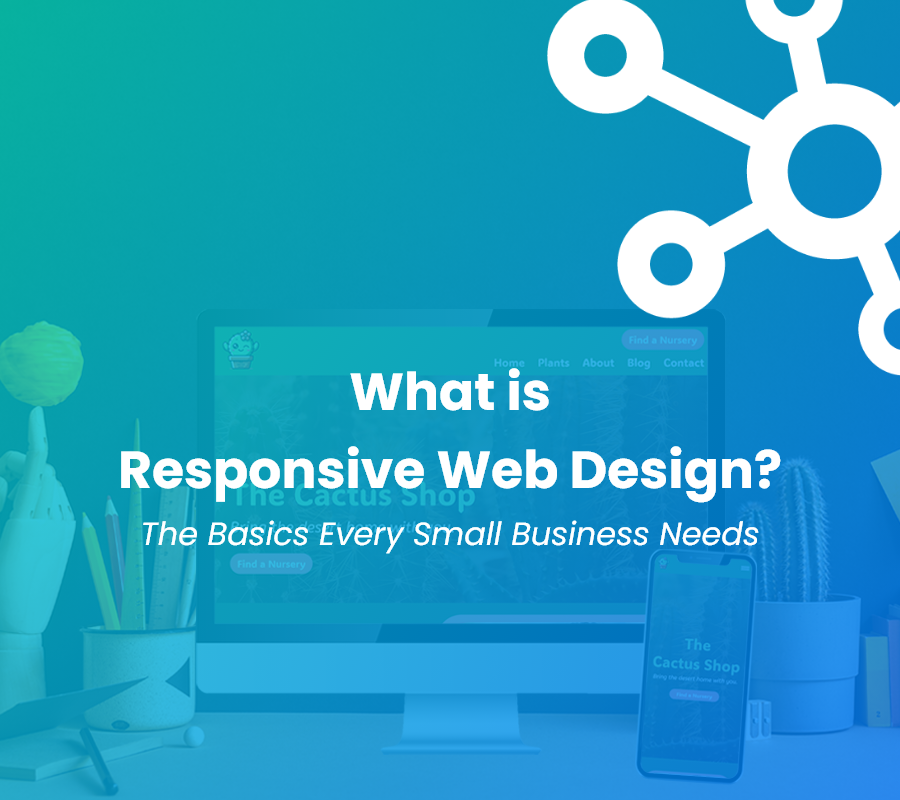
What Does a Responsive Website Look Like?
A responsive website looks clean and well-organized on any device. On a desktop, it might display a multi-column layout with large visuals, while on a smartphone, the same content is rearranged into a single column with touch-friendly buttons and readable text. Images and videos scale proportionally, ensuring nothing appears cut off or distorted, regardless of screen size.
Need a Better Visual?
Take a look at any of our recent website projects to find the perfect responsive web design examples and inspiration. Check out a few of our favorite designs from 2024!


Surviving the Digital Desert
Responsive web design isn’t just a cool feature these days – it’s expected. Every business owner should have a fully responsive website that easily guides leads to their digital oasis.
After ensuring your website is fully optimized and user-friendly, it’s important to regularly check up on your website’s health. Use tools like Search Console or Google Analytics to keep a pulse on your website and what your customers are looking for.
How CyberMark Can Help
Don’t let your business get lost in the sand. At CyberMark, we specialize in creating responsive websites that help small businesses succeed. Our designs are tailored to your needs, ensuring your site not only looks great but also drives results.
Don’t have a responsive website yet? Here’s your chance! Enter our Website Contest for a chance to win a professionally designed site that works on all devices.
Ready to upgrade now? Contact us today to learn more about our web design services.